


If you’re in the market for a new website for your business, there is a good chance that you’ve heard of “responsive web design.”
“Responsive web design” refers to a technology that can be deployed to ensure that your website delivers a great experience to users, regardless of what type of device that they are viewing your website through.
It has become the standard on the web. It has been embraced by some of the largest brands on the web.
Why?
Because it provides a better experience to customers. If you want to compete in Google and look professional to your customers, it is critical that you embrace responsive web design.
Any agency that is not offering responsive design services is likely outdated and not offering the current industry standard.
Let’s take a deeper look at what responsive web design is, why it is important, and what to look for when you are evaluating responsive design services.
The Importance of Having A Mobile-Ready Website
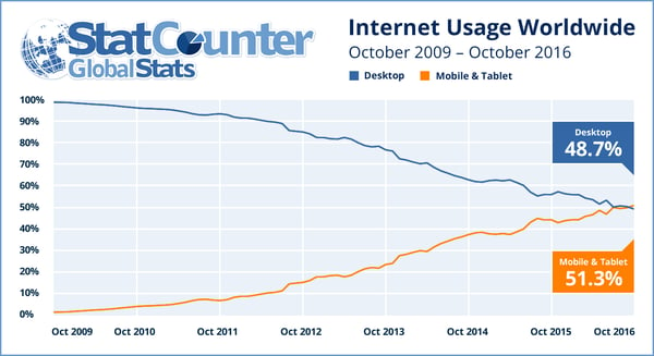
Having a professional looking mobile website has never been more important. In fact, traffic from mobile devices surpassed traffic from desktop computers back in 2016.
If you don’t have a mobile-friendly website already, you are behind the times.
But traffic alone doesn’t fully demonstrate how impactful mobile websites can be. In today’s world, customers are engaging with your website through multiple devices.
They might originally find your website through their desktop computer, but later visit your website through their smart phone, tablet, laptop, and other devices.
You want to make sure that the experience is consistent and professional across all of those devices.
Here are some responsive web design stats that illustrate the importance of having a mobile-friendly website.
- 57% of internet users won’t recommend a business with an unprofessional mobile website.
- 85% of digital customers think that a company’s website when viewed on a mobile device should be as good or better than its desktop website.
- Smartphones make up 63% of all retail website visits.
- 88% of online consumers are less likely to return to a site after a bad experience
- 75% of consumers judge a company’s credibility based on the company’s website.
These stats show that if you want to be successful online, you simply must have a mobile-friendly website that delivers a consistent experience for your visitors across all devices.
It has been important to deliver consistent experiences to users for years. It impacts how they view your company.
It impacts how they feel about your products. It also impacts whether or not they will recommend your company to others they come across. No one wants to recommend an unprofessional company to friends.
You have to give them the appearance of professionalism to win referrals and improve first impressions with new potential customers.
Now let’s dive into the nuts and bolts of responsive web design and how the technology actually works.
What is Responsive Web Design and How Does It Work?
Responsive web design technology was invented to help companies deliver a consistent experience to their users on any device.
The technology works by automatically resizing your website to fit any screen.
In the past, companies would maintain two different websites — a desktop website and a mobile version of their website.
This was a good way to bridge the gap but did create some problems for consumers, namely that the experience wasn’t consistent.
Additionally, as the number of smart devices and varying screen sizes grew, it became more difficult to design mobile websites for all of the different options.
Responsive technology doesn’t require a completely separate web design. Instead, it re-sizes elements of your existing website.
The same website the loads when users visit your desktop website is the same one that loads when they visit it on mobile — the dimensions have just changed to fit the new screen.
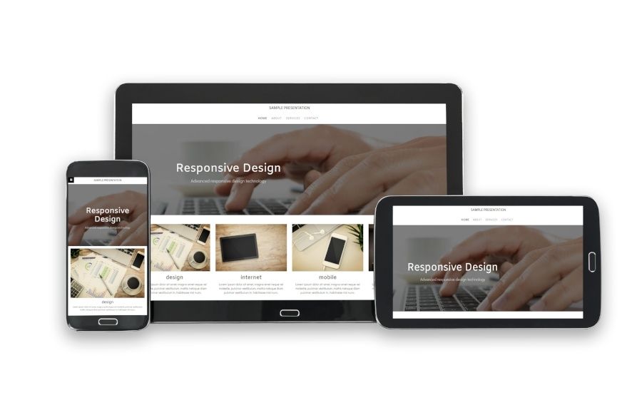
Here’s an image that shows what I mean:

Source: Blue Corona
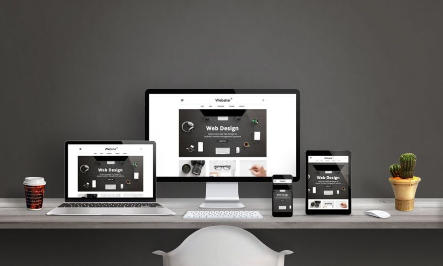
Here’s another example of a website that uses responsive web design across several different screen sizes:
This ensures that your customers and visitors always have a consistent experience on your website, regardless of what device they load it on. It’s always the same webpage, with the same navigation.
Their familiarity transfers between devices and they won’t have to learn a new design like they would with the “mobile websites” from previous years.
The idea is that responsive websites will work with any device, regardless of size. You never have to worry about whether or not your website is loading correctly for customers with a specific smartphone, tablet, laptop, or computer.
Google Embraces Responsive Design
If you want to compete for keywords in Google’s organic search, responsive web design is nearly a requirement.
The company actually embraced responsive web design as far back as 2012, which goes to show you how behind on the times you are if you don’t already have a responsive website.
Today, having a mobile-friendly website impacts your ability to reach customers through their search engine, which is one of the largest online channels for traffic on the web today.
This is why we recommend a responsive web design to all of our clients. It’s baked into every web design proposal that we put together, because to forego it would put our clients in a bad position to compete in their industry.
RiseFuel Specializes in Responsive Websites
Here at RiseFuel, responsive websites are a part of every web design project that we take on. It’s the standard on the web so it is our standard as well.
We’ll start by evaluating your current digital presence and website and design a custom proposal based on your specific needs.
If you are worried that you have fallen behind when it comes to mobile-friendly websites and are looking for a solution to help you reach more customers, create better first impressions, and take competing in Google and other search engines more seriously, click here to schedule a risk free consultation with Tony.