


UX/UI are two terms dealing with how users feel about using the product. They generally refer to website or app design and answer the following questions:
- Does the website load fast enough?
- Is it easy to find the desired products?
- Can users find the essential information by clicking on the links?
- Are the buttons on the page clickable and easy to spot?
- etc.
These and more aspects account for a positive user experience, which is among the decisive factors when making a purchase. However, UX/UI mistakes are inevitable when creating digital products. Your task is to eliminate them from the onset and optimize the eCommerce checkout page design, navigation, and other website sections.
4 Common UX/UI Mistakes to Avoid in 2022
1. Misleading Navigation
One of the first difficulties prospects may face on the website is navigation. It includes the experience of getting from point A to point B and then C. It should be intuitive enough and show the users’ place on the website to return quickly to the previous section.
Do you know the three-click rule? It states that every website page should be accessible in three clicks. Although there are some exceptions, stick to this rule when designing your website or app.
What can tangled navigation lead to? Issues with finding the needed information may cause users to leave the resource and search for more user-friendly alternatives. What can you do to ensure the visitors won’t become disoriented? Here are some top tips:
- simplify the navigation bar, remove unnecessary links to the footer of the page to keep people focused on the essential content;
- if the website requires complex navigation, like in the case of eCommerce stores, create a structure for an elaborate mega-menu;
- show breadcrumbs to indicate the visitor’s place on the website;
- design a hamburger menu to clear the page from excessive links;
- mind the color contrast, white space, and font size for better readability;
- “glue” the menu bar to some part of the page. The most typical position is at the top of the page. But don’t make it too large to block the content.
Here is an example of neat navigation on the American Council on Exercise blog. A sticky bar doesn’t obstruct the vision and lets you proceed to important sections regardless of your position on the page. It also provides a search bar, shopping cart, and a call to action. More blog categories are present on the left side.
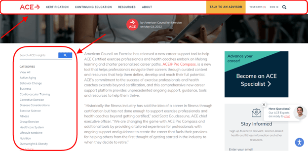
Screenshot taken on the American Council on Exercise website
2. Overloading Customers with Creativity
The desire to stand out from the crowd may lead to an unnecessary focus on creativity. Designers try to customize the website or app, forgetting about usability. While personalization, real images, imaginative graphics, and interactive design features are important for UX, ensure they don’t impact the functionality.
Users demand originality, but they also want to browse the website effortlessly. Remove clutter from pages to provide the needed content people are requesting at the moment. The more features you add, the more pressure it creates on the users’ cognition, reducing their purchase intent. Visitors convert at a lower rate and close such a website.
The same applies vice versa when functionality takes over originality too much. A boring website with the aim just to serve its purpose may divert visitors from conversion. Customers will forget the brand if it doesn’t evoke any positive emotions.
What should you do to stay in people’s minds without overloading them?
- Make a visually appealing, well-designed, original, and innovative website with a slight emphasis on functionality.
- Stay consistent across the website with fonts, colors, and elements.
- Choose between rounded and squared corners of website elements (icons, buttons, blocks, etc.) and stick to them.
- Pick the same line thickness for icons, dividers, and others.
- Ensure there is a reason for deviating from the overall style.
When looking at the New Century Chamber Orchestra screenshot, you may spot several trends. The group has a three-colored logo: pink, blue, and yellow. However, other website parts have different shades. Compare the blue color of a sign-up form, headings, and footer. It creates a sense of inconsistency, which may confuse visitors.
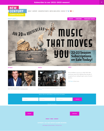
Screenshots taken on the New Century Chamber Orchestra website
3. Forgetting About Responsiveness
Dealing with traffic from different devices is an ongoing trend for website owners. Users explore new ways to access resources, opening websites from laptops, smartphones, tablets, and even IoT objects.
A case in point is mobile traffic. According to Statista, approximately 50% of all visitors worldwide come from mobile devices. Coupled with tablets, smartphones generated 58.99% of all website traffic in the second quarter of 2022. This source has long been around the 50% mark since 2017. And in 2020, it overtook this threshold.
This fact encourages online businesses to develop solutions for a better mobile experience. The website should open instantly, work in unstable conditions, and be convenient on small screens. Plus, mobile-friendliness and loading speed are among the ranking factors after the Google page experience update.
That’s why many companies adopt progressive web app technology. It entails converting the website (or creating it from scratch) into a modern solution. It looks like a native app, supports push notifications, and loads rapidly. But it’s still a website for users to locate from Google search.
Another trend is responsive design. It stands apart from adaptive design, which is about developing separate layouts for various screens. A responsive website perfectly fits any device.
Users can enjoy a cohesive experience with the ability to switch between means of communication. Responsive design also ensures the desktop version won’t suffer if designers keep mobiles alone in mind. Thus, you can maximize conversions from all types of users.
Below is an illustration of what I mean by the RiseFuel website. The desktop version has a wider menu bar, while the mobile one leaves only search and hamburger menu icons. Everything takes its place on the page as it should for you to have a pleasant browsing experience.

Screenshot taken on the RiseFuel website
4. Neglecting the Button Hierarchy
In most cases, you’ll want to provide several options for visitors to do on the website. They may subscribe to an email newsletter, book a call, schedule an appointment, test a demo, or purchase your products. That’s where you need to specify the most desirable options.
One of the mistakes UX/UI designers make is highlighting every button. It misguides users and diverts them from the primary purpose. Instead, pick one option and make it the only bolded and the most visible button on the screen. Leave secondary actions less conspicuous. Users should understand these are clickable buttons but pay attention to those with the strongest visual weight.
That’s how Slack implements different colors for buttons, including “Talk to Sales”, “Try for Free”, “Sign up with Google”, and “Sign up with Email”.
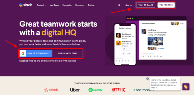
Screenshot taken on the Slack website
Another tip to consider deals with drop-shadows. Don’t overuse this visual effect if you want to design shadows for objects. Make it subtle and avoid black colors. Choose a darker shade of your background color to make the element more natural.
Conclusion
Mistakes are essential in our daily lives. They teach us what we should do in another way next time and contribute to sustainable growth. UX/UI mistakes are also unavoidable. Customers’ demands constantly shift, creating new trends for web design. Even if you jump on every bandwagon and follow the most popular UX/UI principles, it doesn’t guarantee you stay on top of the competition.
We’ve discussed some typical UX/UI issues a website or app may have. We hope they will help you understand how to get a highly-converting solution. The tips from this article will also support you during developing the website/app or evaluating its user-friendliness.
Remember that it’s not just about engagement and creativity. The successful design aims at striking the right balance between aesthetics and functionality. Users should comprehend the purpose of the buttons, find the needed sections, and finish the journey by purchasing your goods and services. And that’s how you will succeed in 2022 and beyond.
---
About the Author
Kate Parish

Kate Parish is the chief marketing officer at Onilab with over eight years of experience in Digital Marketing in the sphere of eCommerce web development. Kate always aspires to broaden her competency in line with cutting-edge global trends. Her primary areas of professional interest include SEO, branding, PPC, SMM, Magento PWA development, and online retail in general.